Tutorial Guide
Hey there, thanks for visiting your CMS Tutorial guide. If you’ve received the link to this page, it means that you’re on your way to getting a fantastic new website!
The purpose of this page is to help give you an idea of all of the different ways we can layout content on your site. We use a Panel Concept, and you’ll be able to view the various options below.
Don’t worry; we will take care of ensuring your new site is both visually attractive and professional. This area is just a hub to help you during your content creation process. If you have any questions or need a little direction feel free to reach out to your account manager, and they will be able to help walk you through the process!
Panel 1: Standard Panel
Our Standard Panel is one of the most diverse panel options we have available. It can be used to create buttons or links, upload PDF’s and supporting documents or any other information you’d like to place here.
The formatting options available here are also complex. We will upload all of the options so that it’s easy for you to use when you’re updating all of your own content.
Header 6
Header 5
Header 4
Header 3
Header 2

Panel 2: Promo Boxes
You can add some text above your promo boxes here if you like!
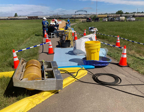
Emergency Management
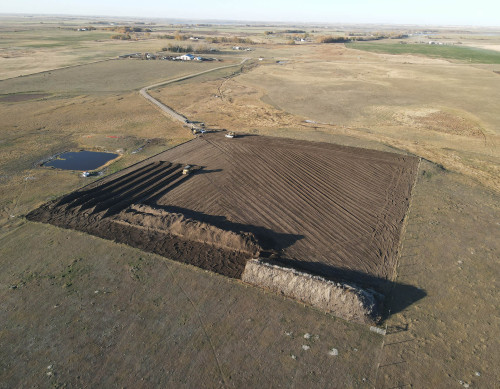
Reclamation
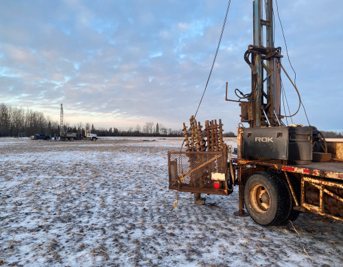
Construction Monitoring
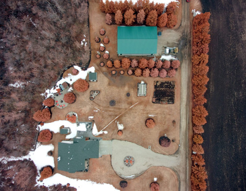
GIS and Data Services
Environmental Assessment and Monitoring
Remediation
Inline Call to Action Panels Are Used to Prompt Action
Subtext for Call to Action panel is styled like this.
Panel 4: Standard Panel With Tabs
Tab One Content
The standard panel tab concept was created to help our users split up content while keeping the page visually enjoyable for visitors.
- You can place in bullet points
- Attach photos and videos
- Create a table for information
The button tab names can be adjusted, so if you have a wide variety of services your company offers you can place it all on one page and users can easily browse through that information.
Tab Two Content
They can be utilized in a multitude of ways and can also be customized to fit your brand!
As displayed below, embedding a picture or video is no problem at all and can be a powerful tool to help compliment your content. As with a standard panel adding in links, buttons or directing the user to find out more information is all possible in this panel.
![]()
Panel 5: Parallax Panel Insert
This panel type should be reserved for a short eye catching blurb of information. As you can see, the words stay in place while the image scrolls behind it. We recommend around 85 - 100 characters in this section if possible. If you need assistance with a background image feel free to reach out to your account manager and they can help you choose one.
Another great addition is that the parallax panel allows for a button which can be a URL link, a phone number or email. Keep this in mind as it’s great for helping with lead generation!
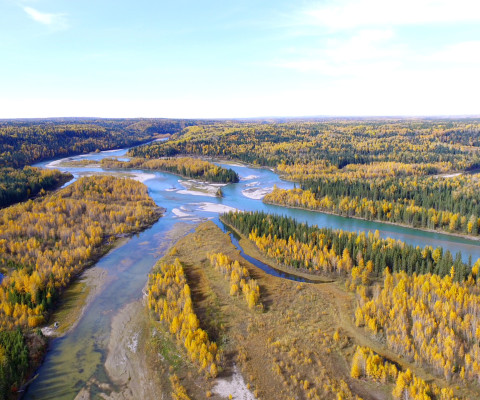
Panel 6: Side by Side (Image)
A Short Subtitle Goes Here!
Here is an example of a Side by Side panel with an image on the right!
They are a great tool that can be used to guide the users attention.
You can place information here and also pair it with a relevant picture to display your information.
Panel 7: Side by Side (Video)
A Short Subtitle Goes Here!
Here is another example of a Side by Side but this time with a video on the left hand side!
You can envision a similar concept as above, but this time you can place a relevant YouTube or Vimeo video here to help users understand the point you are making.
Panel 8: Photo Gallery
Panel 9: Promo Boxes (Mini)
The quick, brown fox jumps over a lazy dog. DJs flock by when MTV ax quiz prog. Junk MTV quiz graced by fox whelps. Bawds jog, flick quartz, vex nymphs. Waltz, bad nymph, for quick jigs vex! Fox nymphs grab quick-jived waltz. Brick quiz whangs jumpy veldt fox. Bright vixens jump; dozy fowl quack. Quick wafting zephyrs vex bold Jim.
Panel 10: Statistics
6,177
Geographic Response Plans
51.2K
Long number field
1,050
ARO Projects
1M
Label Here
1,530
Spill Responses
519
Training Sessions
83.3K
Long number field with multiple commas
TEST: Formatting Options
Phasellus ut eleifend lacus. Quisque id neque eget turpis fringilla condimentum. Aenean at mauris id enim sagittis varius. Sed finibus enim posuere mattis pharetra. Mauris eu velit porta, luctus nisl eget, laoreet sem. Etiam vel porta mi. Aenean tristique facilisis mattis. Curabitur commodo elit felis, nec consectetur nunc elementum at.
Header Three (H3)
Phasellus ut eleifend lacus. Quisque id neque eget turpis fringilla condimentum. Aenean at mauris id enim sagittis varius. Sed finibus enim posuere mattis pharetra. Mauris eu velit porta, luctus nisl eget, laoreet sem. Etiam vel porta mi. Aenean tristique facilisis mattis. Curabitur commodo elit felis, nec consectetur nunc elementum at.
Lorem ipsum dolor sit amet, consectetur adipisicing elit, sed do eiusmod tempor incididunt ut labore et dolore magna aliqua. Ut enim ad minim veniam, quis nostrud exercitation ullamco laboris nisi ut aliquip ex
Phasellus ut eleifend lacus. Quisque id neque eget turpis condimentum fringilla.
Aliquam erat volutpat. Aenean vitae nisi maximus, dignissim nisi sed, commodo orci. Curabitur posuere dui tellus, porttitor vehicula est aliquam vitae.
Header Four (H4)
Lorem ipsum dolor sit amet, consectetur adipiscing elit. Nulla id cursus leo. Phasellus nibh est, ullamcorper sed nunc ac, tempor tempor augue. Nam est leo, mollis quis lectus in, hendrerit varius nisl. Lorem ipsum dolor sit amet, consectetur adipiscing elit. Etiam fermentum lacus posuere mollis dapibus. Cras gravida enim nec euismod bibendum.
"Lorem ipsum dolor sit amet, consectetur adipiscing elit, sed do eiusmod tempor incididunt ut labore et dolore magna aliqua. Ut enim ad minim veniam.”
Header 5 (H5)
Donec sagittis porta nunc vel ornare. Phasellus ut mi facilisis, ultrices nunc in, rhoncus tortor. Aliquam facilisis ex magna, id volutpat justo consectetur eget. Suspendisse scelerisque metus ut neque fringilla, ut faucibus quam venenatis. Proin nec velit porttitor, pulvinar nunc in, lobortis odio. Proin et posuere urna. Praesent vehicula nunc at tortor ultricies, eget tempus tellus faucibus.
| Sample Table Column 1 | Sample Table Column 2 | Sample Table Column 3 |
|---|---|---|
| This table was inserted through tinyMCE. | All of the styles (borders, colors, alignment, paddings) can be edited through the tinyMCE editor. | You can create multiple rows and columns. |
| You can assign which cells to be used as labels or "header cells" | This table is completely responsive. | It is best to not specify a width when creating tables as it will affect the responsiveness of the table (do not drag the edges of the cells - doing so will assign fixed widths to the cells). |
Header 6 (H6)
Phasellus ut eleifend lacus. Quisque id neque eget turpis fringilla condimentum. Aenean at mauris id enim sagittis varius. Sed finibus enim posuere mattis pharetra. Suspendisse scelerisque metus ut neque fringilla, ut faucibus quam venenatis.
Curabitur maximus ante ac efficitur consectetur. Curabitur lobortis vitae enim sit amet maximus. Sed in semper ante. Pellentesque egestas magna dapibus, egestas tortor non, malesuada urna. Nulla lectus mi, condimentum in commodo et, semper et tortor.
new test panel
Our Standard Panel is one of the most diverse panel options we have available. It can be used to create buttons or links, upload PDF’s and supporting documents or any other information you’d like to place here.
The formatting options available here are also complex. We will upload all of the options so that it’s easy for you to use when you’re updating all of your own content.
Header 6
Header 5
Header 4
Header 3
Header 2

